Building a Custom React Panel with Foxglove Extensions
Create project-specific visualization tools for your robotics team

At Foxglove, our team’s North Star is to provide robotics teams with general-purpose visualization and debugging tools. We believe in focusing on the features that are most useful to the greatest number of our users.
With that said, your team may still have domain-specific needs that our open source tooling doesn’t address. While we want to prioritize generally applicable features, we still want to empower you to develop tools customized to your needs – all while leveraging Foxglove’s existing data and layout management features.
That’s where Foxglove extensions come in. In this tutorial, we’ll walk through how you can develop custom Foxglove panels for your unique workflows.
Getting started
Let’s start by generating an extension template with create-foxglove-extension:
$ npm init foxglove-extension@latest extension-demoOpen the newly created extension-demo/ folder in an editor of your choice – in src/index.ts, you’ll see an example panel being registered with a human-readable display name for Foxglove.
Change the default name from “example-panel” to “Extension Demo”:
extensionContext.registerPanel({ name: 'Extension Demo', initPanel: initExamplePanel });In src/ExamplePanel.tsx, you’ll see a simple ExamplePanel that uses React state to keep track of seen topics, seen messages, and its render status:
function ExamplePanel({ context }: { context: PanelExtensionContext }): JSX.Element {
 const [topics, setTopics] = useState<readonly Topic[] | undefined>();
 const [messages, setMessages] = useState<readonly MessageEvent<unknown>[] | undefined>();
 const [renderDone, setRenderDone] = useState<(() => void) | undefined>();
This example panel will run the following onRender function whenever it receives any relevant RenderState updates:
useLayoutEffect(() => {
  context.onRender = (renderState: RenderState, done) => {
    setRenderDone(() => done);
    setTopics(renderState.topics);
    setMessages(renderState.currentFrame);
  };
}, [context]);
You’ll see that this onRender updates the panel state with a few items:
- New
donecallback, to indicate that the panel has finished its previous render cycle and should re-render - New topics from the data source
- New messages on subscribed topics
Next, the panel will watch for new topics and new messages on our subscribed topics. Any changes to these RenderState fields will trigger the onRender function:
context.onRender = (renderState: RenderState, done) => {
  // ...
};
context.watch('topics'); // new topics
context.watch('currentFrame'); // new messages
Finally, the panel will subscribe to an array of topics – new messages on these topics will populate the RenderState’s currentFrame. Once rendering finishes, we invoke the panel’s most recently set renderDone callback:
context.subscribe(['/some/topic']);
useEffect(() => {
  renderDone?.();
}, [renderDone]);
At the bottom of the ExamplePanel function, we see how all this logic is used to render a table of the data source’s topics and schema names:
return (
  <div style={{ padding: '1rem' }}>
    <h2>Welcome to your new extension panel!</h2>
    // ...
    {(topics ?? []).map((topic) => (
      <>
        <div key={topic.name}>{topic.name}</div>
        <div key={topic.datatype}>{topic.datatype}</div>
      </>
    ))}
    // ...
  </div>
);
Installing locally
Now that we’ve walked through what our template does, let’s see this panel in action locally.
To install the extension in your local Foxglove desktop app, compile your extension code in a folder under your home directory (e.g. ~/.foxglove/extensions/unknown.extension-demo-0.0.0):
$ cd extension-demo/
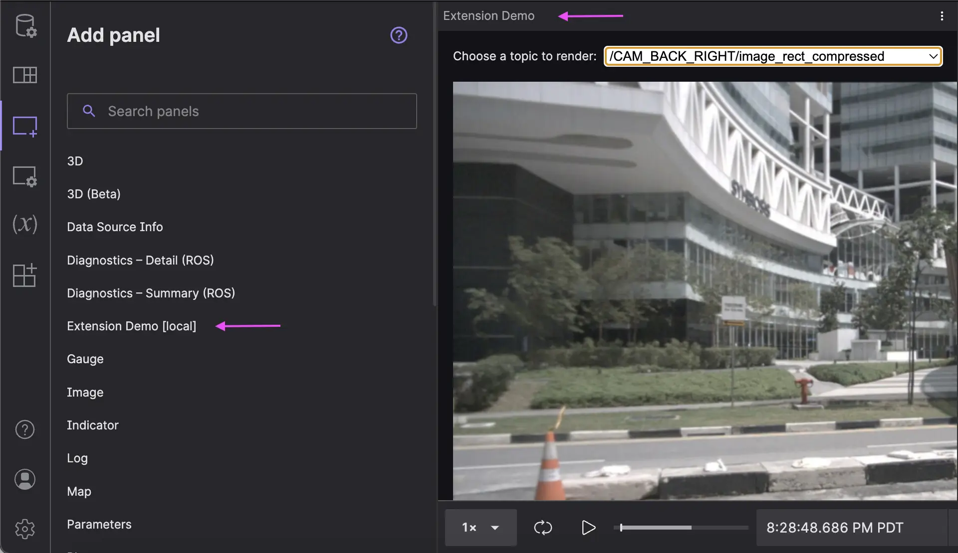
$ yarn local-installIn Foxglove, you should now be able to see and add an “Extension Demo” panel to your layout:
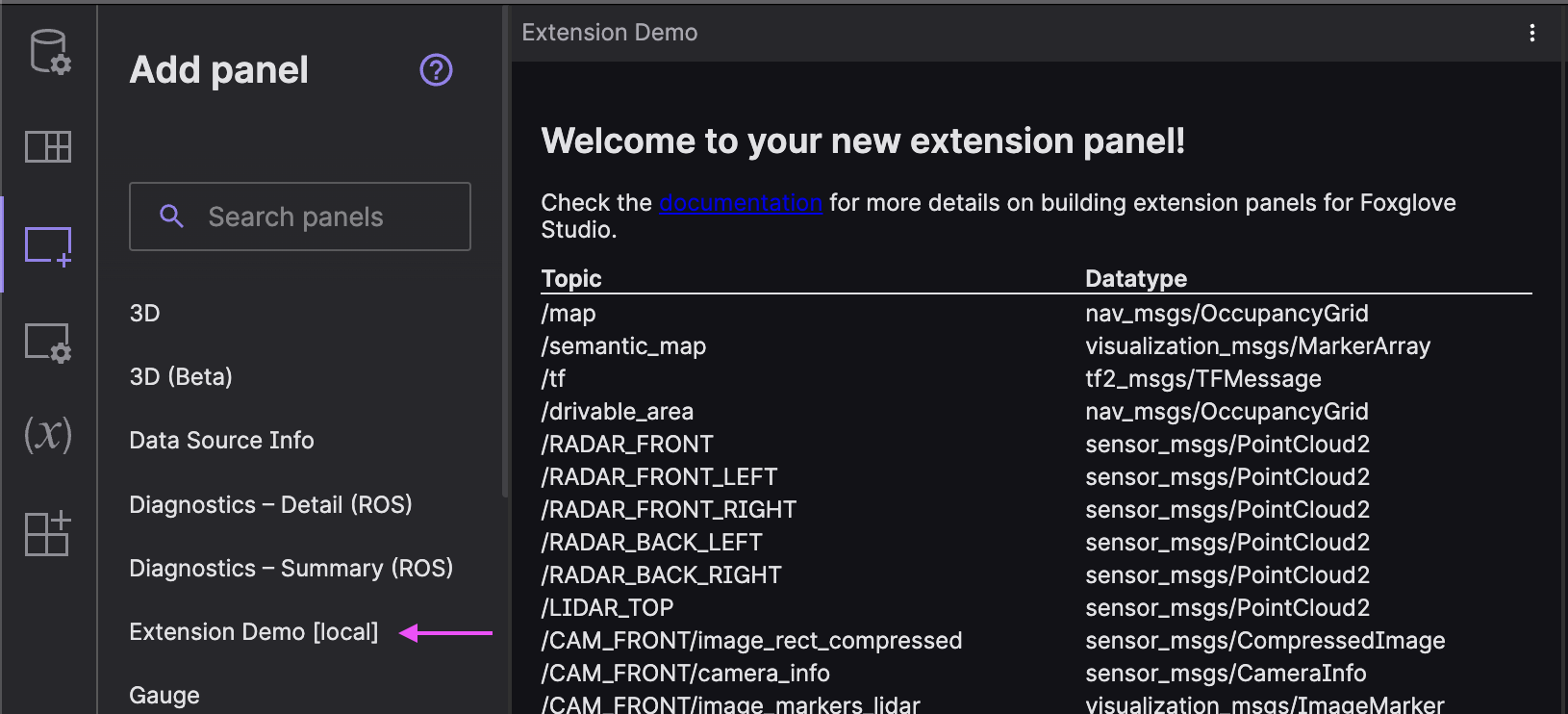
If you load your own data (or explore Foxglove’s sample data), the “Extension Demo” panel should display a table of the data’s topics and schema names.
You’ve successfully loaded your first Foxglove extension!
Developing a custom extension
Now’s the time to get creative! Whatever project-specific need you have that Foxglove’s out-of-the-box panels don’t meet, you can build yourself.
For this tutorial, let’s build a simplified version of the Foxglove Image panel – one that allows users to choose from a dropdown of available image topics and displays the first image seen on the selected topic.
Build the dropdown menu
First, let’s add the user controls we need to our interface – namely the image topic dropdown menu.
We’ll need a list of all image topics (i.e. those with a sensor_msgs/CompressedImage schema):
import { useLayoutEffect, useEffect, useState, useMemo } from 'react';
function ExamplePanel({ context }: { context: PanelExtensionContext }): JSX.Element {
  // ...
  const [renderDone, setRenderDone] = useState<(() => void) | undefined>();
  const imageTopics = useMemo(
    () => (topics ?? []).filter((topic) => topic.datatype === 'sensor_msgs/CompressedImage'),
    [topics]
  );
  // ...
}
We’ll also need save the user-selected topic to the panel state, and subscribe to its future messages:
type PanelState = {
  topic?: string;
};
function ExamplePanel({ context }: { context: PanelExtensionContext }): JSX.Element {
  // ...
  const [state, setState] = useState<PanelState>(() => {
    return context.initialState as PanelState;
  });
  useEffect(() => {
    context.saveState({ topic: state.topic });
    if (state.topic) {
      context.subscribe([state.topic]);
    }
  }, [context, state.topic]);
  // ...
}
As a nice user experience consideration, you can select the first available image topic by default, so we can start displaying an image as soon as relevant messages become available:
useEffect(() => {
  if (state.topic == undefined) {
    setState({ topic: imageTopics[0]?.name });
  }
}, [state.topic, imageTopics]);
Now, we can finally render the dropdown menu in the ExamplePanel’s return:
return (
  <div style={{ height: '100%', padding: '1rem' }}>
    <div style={{ paddingBottom: '1rem', display: 'flex', gap: '0.5rem', alignItems: 'center' }}>
      <label>Choose a topic to render:</label>
      <select
        value={state.topic}
        onChange={(event) => setState({ topic: event.target.value })}
        style={{ flex: 1 }}
      >
        {imageTopics.map((topic) => (
          <option key={topic.name} value={topic.name}>
            {topic.name}
          </option>
        ))}
      </select>
    </div>
  </div>
);
Set the message to render
Before displaying an image, we need to determine the correct message to render.
Install the @foxglove/schemas package:
$ yarn add @foxglove/schemasImport the package’s CompressedImage TypeScript schema so we can define an ImageMessage type:
import { CompressedImage } from '@foxglove/schemas';
type ImageMessage = MessageEvent<CompressedImage>;
Since we’re only interested in drawing a single image at a time, let’s change our existing messages / setMessages state variables to message / setMessage:
function ExamplePanel({ context }: { context: PanelExtensionContext }): JSX.Element {
 // ...
 const [message, setMessage] = useState<ImageMessage>();
Then in our existing onRender function, replace setMessages(renderState.currentFrame) with the following logic to save the last seen image topic message:
if (renderState.currentFrame && renderState.currentFrame.length > 0) {
  setMessage(renderState.currentFrame[renderState.currentFrame.length - 1] as ImageMessage);
}
We now have a reference to the image topic message we want to render in our panel state.
Render the image
Add a canvas HTML element to the panel’s return value:
import { useLayoutEffect, useEffect, useState, useMemo, useRef } from "react";
function ExamplePanel({ context }: { context: PanelExtensionContext }): JSX.Element {
 // ...
 const canvasRef = useRef<HTMLCanvasElement>(null);
 // ...
 <canvas width={480} height={480} ref={canvasRef} />
</div>
Outside our ExamplePanel function, define a drawImageOnCanvas helper function:
async function drawImageOnCanvas(imgData: Uint8Array, canvas: HTMLCanvasElement, format: string) {
  const ctx = canvas.getContext('2d');
  if (ctx == undefined) {
    return;
  }
  // Create a bitmap from our raw compressed image data.
  const blob = new Blob([imgData], { type: `image/${format}` });
  const bitmap = await createImageBitmap(blob);
  // Adjust for aspect ratio.
  canvas.width = Math.round((canvas.height * bitmap.width) / bitmap.height);
  // Draw the image.
  ctx.drawImage(bitmap, 0, 0, canvas.width, canvas.height);
  ctx.resetTransform();
}
Every time we see a new message on the user-selected image topic, let’s use our previously defined canvasRef to draw the image message’s data on our HTML canvas:
useEffect(() => {
  if (message) {
    drawImageOnCanvas(message.message.data, canvasRef.current!, message.message.format).catch(
      (error) => console.log(error)
    );
  }
}, [message]);
We’ve finished our first custom Foxglove extension!
Testing in Foxglove
Now that we’ve written all our code, let’s test our extension with some real data in Foxglove!
First, build your changes to your local extensions folder:
$ yarn local-installThen, reload Foxglove to see the latest version of your extension live!
Add the panel to your layout, load some data, and select different topics from the dropdown menu to see the interface in action:
You’ve just developed and installed your first custom Foxglove extension!
Sharing your extension
Now that you’ve created an extension locally, let’s package it up so you can share it!
Make sure you’ve set all relevant metadata fields in the package.json file – i.e. the extension’s name, publisher, version, and description. Then run yarn package to package your extension manifest and compiled code in a ZIP archive (i.e. extension-demo-0.0.0.foxe).
Once you’ve packaged your extension, you have two ways to deploy it – by sharing it privately or publicly.
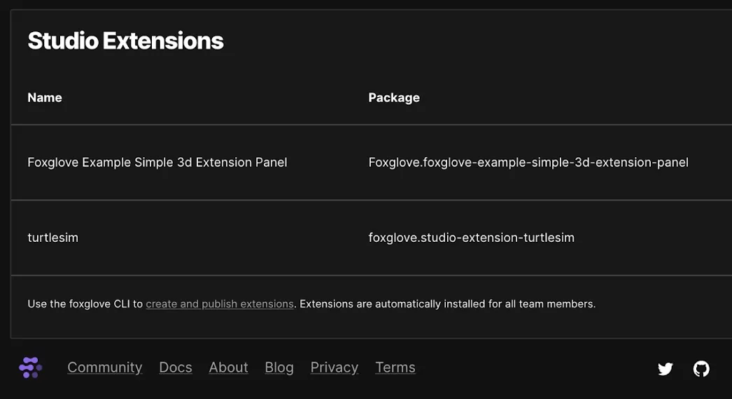
To share your extension privately with your Foxglove organization, publish it to your team. All teammates registered with your Foxglove organization will have your extension installed by default in their Foxglove apps when they sign in to their account.
To share your extension publicly with all Foxglove users, submit your extension code as a PR to the extension registry. This displays your custom panel in your app settings, for users to optionally add to their panel list.
Stay tuned
If you’re feeling adventurous, you can build on top of your “Extension Demo” panel by adding user-configurable panel settings.
In the future, we hope to support more varied use cases for custom extensions – i.e. to support custom file formats, data sources, and message decoders in Foxglove. Please feel free to reach out to us in our Discord community to give feedback on what you’d like to see in our next iteration of the extensions ecosystem!
You can find the full code snippet covered in this tutorial in the examples/ directory of the create-foxglove-extension repo. For a more detailed look at all the API methods used in this tutorial, check out the extension panel API docs.