Announcing: A new and improved, blazing fast State Transitions panel.
A faster State Transitions panel that uses less memory.


We rebuilt the State Transitions panel from the ground up to meet the challenge of visualizing large volumes of time series state data, a pain point for many of our users. The upgraded State Transitions panel is faster, uses less memory, and introduces some subtle UI changes to help improve clarity and scanability.
What’s new?
Twice as fast and half the memory usage.
Performance of the State Transitions panel took a major leap forward in Foxglove v2.16. We made the initial loading of recorded data more than twice as fast by switching to the same APIs used by the Plot panel, which means you’ll spend less time waiting when switching between datasets to help you stay in the flow of your analysis.
Panning and zooming within the panel is now up to an order of magnitude faster. We optimized the pipeline using a single-pass downsampling approach coupled with some tricks for rendering high-density data to the screen, along with double-buffering to ensure that the concurrent worker threads are being fully used. The result is buttery smooth performance even when you’re working with large or densely-populated datasets. This is true even when the “Show points” setting is enabled, which previously incurred a large performance cost.
State Transitions panel with the “Show points” setting set to true.
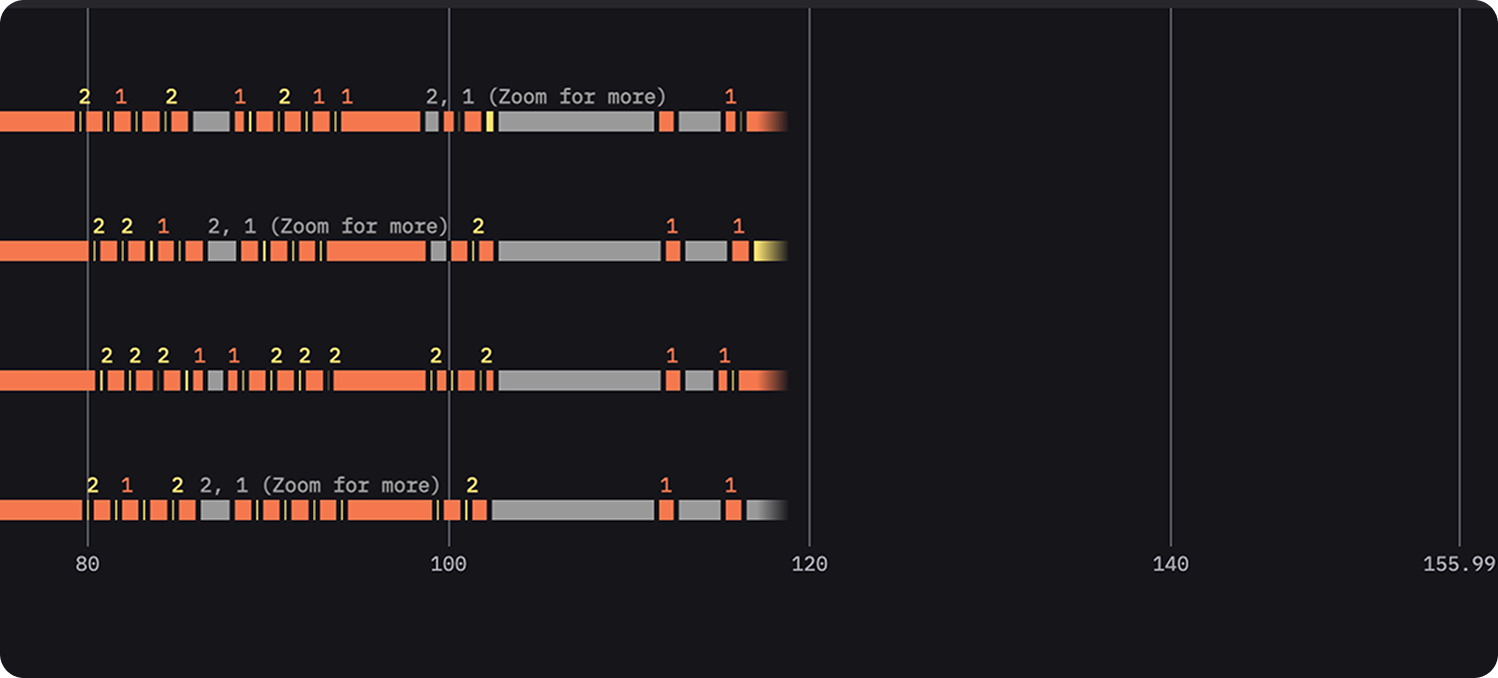
We also made the underlying data store more compact using typed array buffers and lookup tables, which improved memory usage by up to 2x. This allows you to load more data than before to help make decisions and uncover patterns across longer time ranges.
State Transitions panel with a long time range of data displayed.
A visualization model that makes your data clear.
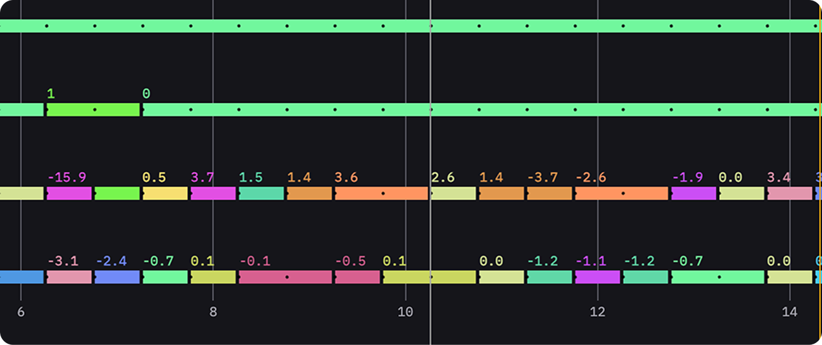
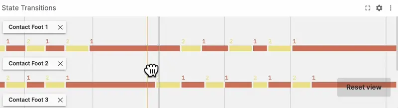
Previously, adjacent states would be difficult to distinguish when their colors were similar. In some situations – due to an intentionally limited palette and determinism requirements – distinct and adjacent states might even map to the same color. This defeated the core purpose of the panel: to visualize transitions between states. We considered and ultimately rejected many strategies for visualizing state boundaries, and eventually decided on the simple addition of a small, fixed-size gap between all adjacent states. The gap is both subtle and crisp: it clearly communicates the state transition without being affected by zoom levels or requiring any degree of color perception, and incurs only a slight information density cost.
State Transitions panel showing the subtle gap between adjacent states.
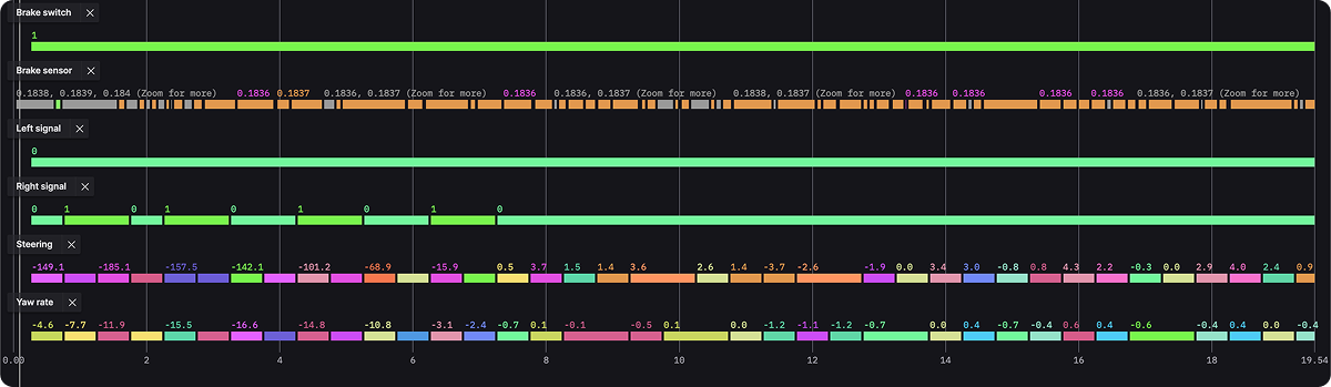
When zoomed out to a longer period of time, the density of transitions in the data is such that each state would be smaller than a pixel. For these situations we’ve added labeled summarization blocks and improved tooltips which provide more useful information, even when states are elided.
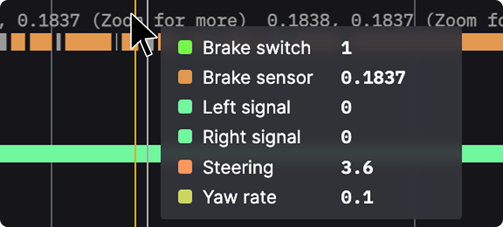
State Transitions panel showing the improved tooltips.
We also introduced a clear loading indicator instead of having an ambiguous blank space for when we know that we are still waiting on data.
State Transitions panel showing the loading of a large dataset.
Navigation that feels even more natural.
The way charts respond to your actions should be permissive, not restrictive. In the old panel, you could only grab to pan within specific rendered regions, and vertical scrolling required grabbing a tiny sliver of a scrollbar—something that could cause frustration in smaller panels.
Now, you can grab and drag anywhere on the chart to pan horizontally or scroll vertically which makes navigating smoother and faster. You can move through your data without breaking your flow, and there’s no need to hunt for a scrollbar to reach different rows of states.
State Transitions panel panning horizontally and scrolling vertically.
We realize that even with these improvements, navigating the panel can be challenging – especially when there are many rows of states. We are actively working on improving this experience.
Wrap up.
With the upgraded State Transitions panel, you have more control and visibility over your data than ever before.
Effortless navigation: Drag anywhere in the panel to pan or scroll, giving you full control over large timelines.
Precision zoom: Explore areas of interest without interruptions. The improved zoom and rendering engine ensures smooth transitions at every level of detail.
Meaningful summaries: Hover over states to reveal detailed transition information. All the data you need is at your fingertips.
Sharp focus: The new visualization model more clearly visualizes state transitions, supporting the core purpose of the panel.
Stay tuned for more updates, which will also bring improvements to our Plot panel!
Sign up to dive into the new panel and see how it improves your workflow. Your feedback is always welcome so join the Foxglove community and let us know what you think.
Check out the State Transitions panel documentation for more details. Happy debugging!