Improved Topic Discovery and Visualization in Foxglove
Drag-and-drop topics into select panels for instant visualization
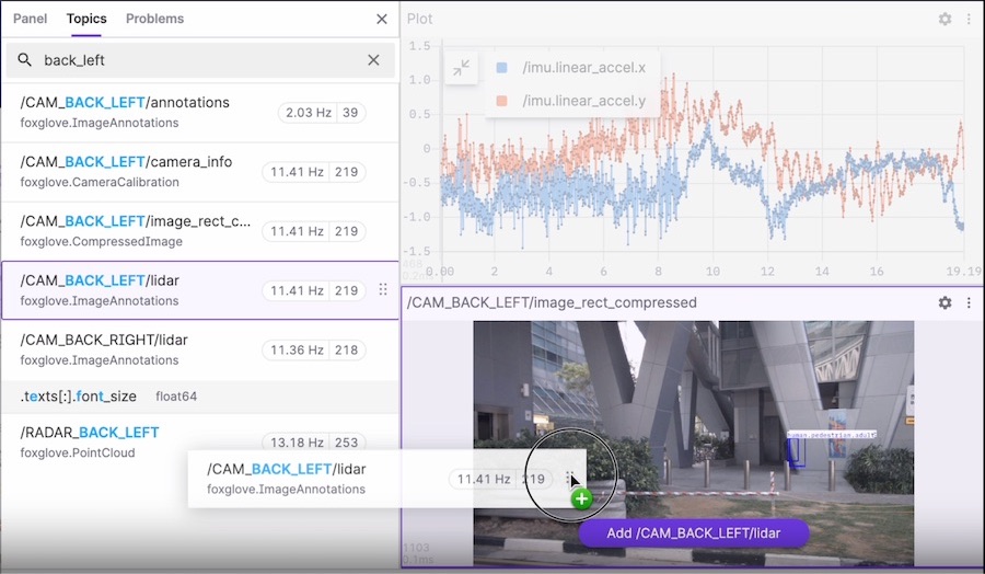

Foxglove users can now search for relevant topics and message paths via the “Topics” sidebar, and then drag-and-drop the one they want to visualize into select Foxglove panels (Raw Messages, Image, Plot, State Transitions, and Table).
Getting started
It’s become easier than ever to find and explore data you’re interested in. Instead of using each panel’s settings and interfaces to select topics to display, you can now search for relevant data and decide how to visualize it all in one place.
To get started, open or connect to a data source in Foxglove. Then, open the “Topics” sidebar to search your data source for topics and message paths you want to inspect:
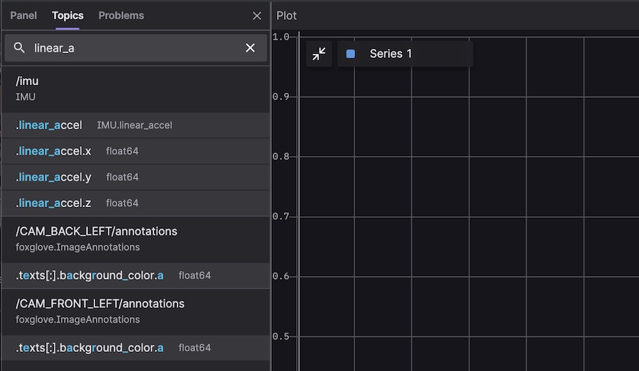
From there, drag-and-drop the desired message paths into the panel of your choice to display them. For example, you could plot your IMU’s linear acceleration on all 3 axes by dragging these paths (/imu.linear_accel.x, /imu.linear_accel.y, and /imu.linear_accel.z) into an available Plot panel:
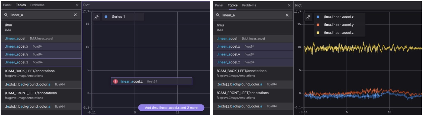
To select multiple message paths for drag-and-drop visualization, use “Shift” to select a range of adjacent items, or “Ctrl” (and “Cmd” on macOS) to select and deselect multiple non-adjacent items.
If a message path isn’t supported for visualization by a particular panel, the panel will be grayed out:
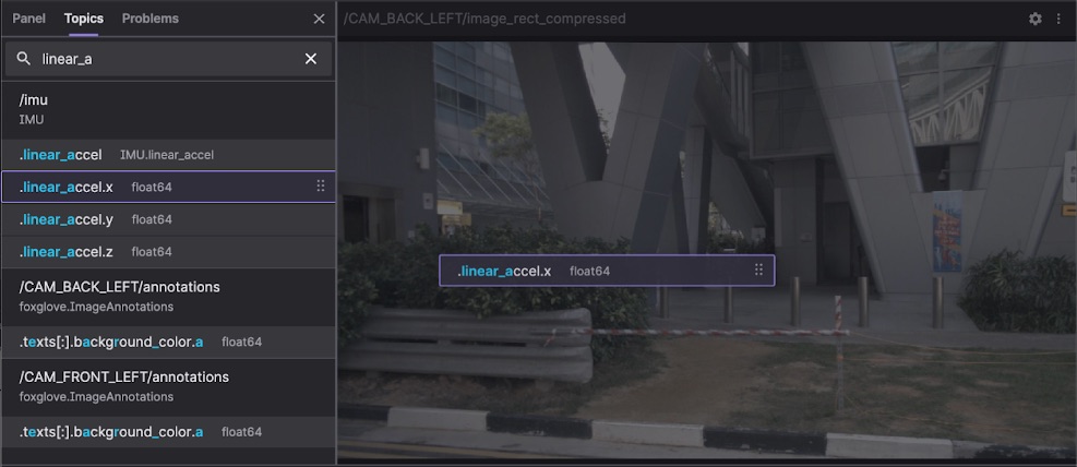
After dropping a message path onto a panel, open the panel’s settings to edit the selected topic or configure any other options.
Stay tuned
With this new search and drag-and-drop support, we hope Foxglove is helping make multimodal data visualization easier, faster, and more seamless than ever for your entire robotics team.
As always, feel free to share your questions and feedback in our Discord community, Twitter, or LinkedIn).


