Refining the Plot panel: upgrades to a core tool.


The 2D Plot panel isn’t a particularly flashy feature. But it is an essential, multi-purpose tool to characterize signals, inspect telemetry, and correlate behaviors. For many workflows, plots are the primary means of understanding patterns in data.
And like any foundational tool, over time Foxglove’s Plot panel had accumulated some grit: confusing settings, visual glitches, and conspicuously missing functionality. Over the past quarter we embarked on a mission to smooth some of the rough edges felt in everyday use.
Read on and view the docs to see what’s changed!
Faster, more precise navigation.
Our long-term goal is that navigating the plot should feel like an extension of intent rather than an interruption of flow. One small step we took in this direction was adding a new zoom tool which allows you to select a region of interest by dragging a box around it. Enable it with z, cancel with Esc. It’s very simple, but it makes exploration much more precise.
It’s now easier to select a particular axis, either with the new zoom tool or with the existing scroll zoom: you can hold Alt/Option to specify the x-axis, Shift to specify the y-axis, or both. Or, you can simply hover and scroll over the target axis.
The Foxglove Plot panel with the new zoom tool.
The Foxglove Plot panel with the new zoom tool.
Tools to inspect, measure, and understand.
Plot tool controls like the legend toggle and the reset view button are now in the panel toolbar, freeing valuable space and making these features readily accessible without overlapping the plot data.
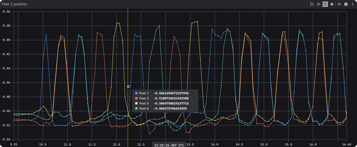
In addition to refinement, we added new tools for analysis: most notably, point inspection and measurement in all plot types. With the inspection tool enabled, you can select points on the plot to highlight their values, draw cursors, and measure deltas.
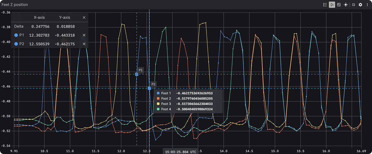
The Foxglove Plot panel showing the new inspect and measure tool.
The Foxglove Plot panel showing the new inspect and measure tool.
Message path-based XY plots now support locking axis scales to a strict 1:1 ratio, which is valuable for visualizing spatial data with the same units on each axis. We also introduced support for setting x-values independently per series in message path plots, and for drawing timestamps from custom fields in time series plots.
Meanwhile, we polished tooltip behavior and hover interactions across plot types. Tooltips now appear more predictably, handle downsampled plots better, and surface more helpful information in message path-based XY plots.
Approachable configuration.
Over the years, incremental additions left the plot settings cluttered and opaque. The Plot panel supports a wide variety of chart types and configuration patterns, but that power was sometimes obscured by unclear labels and a muddled mental model.
One small but significant change is that the “X-axis value type” is now the very first setting, which is valuable because the choice affects a number of downstream options. It lets you choose between creating a time series plot where only the y-axis values are drawn from message data, creating an XY plot where both axis values are drawn from message data, or creating an XY plot where x-values are array indices. Previously, many people didn’t know it existed.
To help new users, we clarified and reworked a range of confusing terminology. In message path-based plots for example, “Path (accumulated)” vs “Path (current)” became “Time range: All vs Latest”. For time series plots we removed the confusingly implicit x-axis behaviors, and added an explicit “Time window” option for choosing between a sliding window that follows playback or fixed time bounds.
Visual polish and performance.
We fixed a longstanding annoyance for users working with stacked time series plots with synced axes: time misalignment. Now, the x-axes in vertically-stacked time series plots share the same tick spacing and alignment, allowing you to precisely correlate signals across plots.
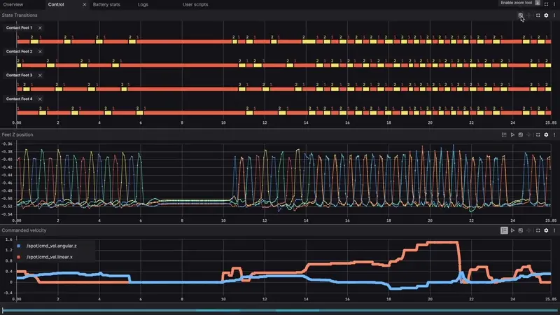
Time-synced axes in the Plot and State Transitions panels.
Time-synced axes in the Plot and State Transitions panels.
Many subtle rendering issues such as jitter, flicker, and inconsistent tick marks have been fixed. Memory usage has also been significantly reduced when working with high-density message-path based plots.
Evolving thoughtfully.
While these changes touched nearly every corner of the Plot panel, this wasn’t a redesign: it was a careful tune-up of one of Foxglove’s most-used tools. The goal wasn’t to reinvent the Plot panel, but to sharpen it with a focus on reducing friction, increasing clarity, and expanding capability.
As always, we’d love to hear how these updates are working for you, and what you’d like to see next. Our goal is that the Plot panel should stay out of your way and help you stay in the flow.
Join our community and hit us up with your feedback anytime.